I conducted some primary audience research in order to:
- Find out what appeals to my target audience
- To discover any flaws or potential improvements that could be made to my magazine genre
- To identify any gaps in the market and place a refreshing new twist on the genre.

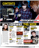
Above are the chosen products that I conducted my research on.
I asked my fellow class mates seven questions which they responded to:
1. What age do you think the target audience is?
2. What genre do you think this magazine is? Why?
3. Do you think the colour scheme looks professional? What could be improved?
4. What do you think about the layout of the double page spread?
5. Is there consistency between the front cover, contents page and double page spread?
6. Does the language used on the front cover and contents page make you want to read on?
7. Do you think the masthead fits with the genre? If so, how?
From the research I did, with a selective sample from my target audience, I found that (some quotes included):
- The age of the target audience was teenagers with around the age 15 to 20.
- The gender of the target audience is both genders, but mostly male 'as the genre is very aggressive'.
- The target audience is aimed for middle class people in the C1/C2 category.
- The magazine genre is rock because of the use of rock bands throughout the magazine.
- The language used is slang with 'smashing captions' so is suitable for the target audience and makes them want to read on. - 'slang language so makes people want to read on as they wonder what it is about'/'I'd be more interested in the main story of the article rather than the language used to convey it'.
- The colours used are bold and bright to suit the target audience and genre as they stand out as 'bold and bright colours are typically what you would find in rock related magazines'
- 'The large image on the double page spread shows the attitude of the band which is similar to the attitude of the target audience.'
- The masthead suits the target audience as it is 'big and bold' so suits the target audience and genre of rock.
- The target audience is mainly aimed at middle class males as the type of music is aggressive.
- The cracked text on the masthead creates a 'grungy effect' and represents the aggressive nature of rock.
- To improve, the three colour palette scheme should be the same throughout unlike this magazine where the cover page and contents page is black, white and yellow and the double page spread is black, white and red.
- The colours of the white text used against the black background is effective as it shows contrast so stands out easily.
- The difference of the blue to the three colour palette scheme on the front cover shows that there could be an alternative side to the genre.
- I will use lots of images of rock bands/artists throughout my magazine to show that the genre is rock.
- I will use a bold and bright colour scheme to suit the target audience and make it stand out, and the three colour palette scheme will be consistent and carried out throughout the magazine.
- I will use slang language to suit the teenage target audience and 'smashing captions' to make the reader interested and want to read on.
- The image on the double page spread will be large and and the models will be showing attitude to represent the attitude of the target audience.
- I will make the masthead big and bold to suite the target audience and genre of rock.
- I will make the masthead text cracked to show a grungy effect and represent the aggressive nature of rock.
- I will use white text against a black background so it stands out easily as they contrast.


No comments:
Post a Comment